You write a book. You put a cover on it. Why change it? ? Recently, I spent a good amount of money completely rebranding my light romantic mystery series set in Las Vegas, The Lucky O’Toole Vegas Adventure Series. That meant new covers for nine novels, four novellas and a couple of bundles. Which then meant uploading to the retailers, changing my website, updating the various social media outlets…and probably several other places I’ve forgotten in the haze.
One of the fabulous things about working with B&N Press and being in control of my publishing career is that I can do this sort of thing. But the question remains: Why would any sane person do this?
Well, here are three reasons why it might be time to consider a redesign of your own book cover.
By Deborah Coonts
1.FIRST IMPRESSIONS
Way back in 2010, I anxiously awaited the cover for my very first book to be published ever, Wanna Get Lucky? Somehow, I’d scored a hardcover/paperback deal with a Big Five publisher. Back then, in the Dark Ages of Publishing, that was considered the gold standard. You can imagine my excitement.
Then the book cover arrived. And I cried. Literally. Dark blue and ugly, not one color or font style even hinted at the “funny” inside.
Eventually, I prevailed, and the publisher changed the cover. They added orange. Better, but it still looked like a Michael Connelly cover. Don’t get me wrong, I love Michael’s books. But, suffice it to say, our stories and styles are so different that Michael and I could speak different languages. Our covers should reflect that.
Also, each genre has a specific template, if you will. A style that conveys immediately this is a mystery, thriller, romance and, is funny, dark, or serious.
Your cover is your first chance to entice a reader to pick up your book, or to click and read the blurb. Your first step to making a sale, and hopefully, a fan. So, if a cover isn’t pulling its weight, it isn’t pick-up-able or clickable, change it.
2. STYLE CHANGES
Cover design is an art. And much like art styles that fall in and out of favor, so too, do cover styles. Writing is also an art. And literary style has evolved through the ages. . Compare Dickens and Evanovich, H. Rider Haggard and Tom Clancy. Dashiell Hammett and…well, you get my drift. If you look at covers from days gone by, you’ll notice how different they look from covers dotting the shelves today. Take some time looking at your genre at a Barnes & Noble store or on BarnesandNoble.com to see if your cover is in line with the current trends. If it’s looking dated, change it.
3. BRANDING
Writing is a business. Yes, we all would love to live the fantasy of a garret in Paris where we write our deathless prose, then send it off to a fabulous publisher who publishes us so well that we become the exception to the starving-artist rule.
Got news for you: ain’t happening. Sorry.
Today, authors not only create a product, we must perfect it, package it, market it and sell it. Yes, we are authorpreneurs. Like it or not we run a small business. Each and every one of us, even those with a publishing partner or simply those of us with distribution partners.
And one of the basic business principles we must apply to our own endeavors is branding. If you look up the term, you’ll find all kinds of circuitous language, but, to me, branding is a consistent, identifiable presence in the market that is yours alone. Also, to me, there are two aspects to branding: what the customers/readers see (a visual brand) and what they come to expect from you through interaction and experience (intrinsic brand.)
The visual brand:
When someone sees a thumbnail of one of my books, I want them to know that book is a Deborah Coonts novel. Before I changed all my covers, the original covers spoke to the funny mysteries inside, but they didn’t look like they belonged to the same series. So, I fixed that.
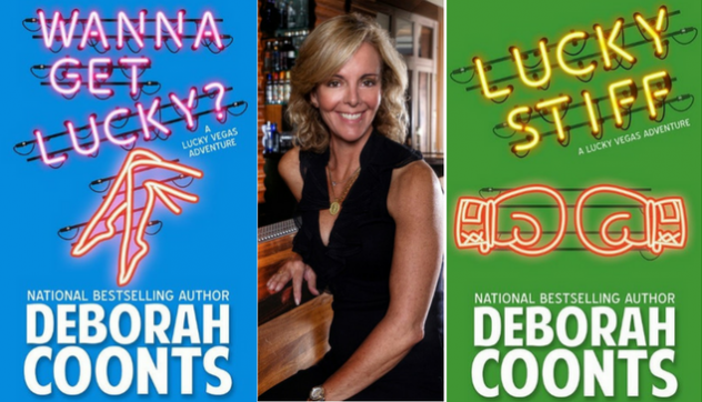
Here’s a sample of what they look like now:


These covers look like they belong together. The funny is in there. Even a bit of Vegas. They work.
I’ve used these covers or a variation of the concept on my website banner, my social media banners, and all other places I can get myself and my stories in front of story lovers. This is my visual brand.
The Intrinsic brand:
To me this encompasses what the readers have learned to expect from you. What we all want is for our readers to know they can expect a high-quality story that is well-written, well-edited, formatted properly and delivered in a manner that enhances the reading experience. In short, we want them to know we are professionals.
Your cover is the first clue to the reader that you know what you’re doing—and you care enough to spend the time and money, the blood, sweat and tears, to make your book the best it can be. You want a cover that is well designed, appropriate for your genre, and informative for your readers. Unless you are a graphic designer steeped in cover esoterica, I suggest hiring a professional. They are worth every penny.
So, that’s my answer to the “why”. My new covers have increased overall sales as well as sell-through of the entire series. Yep, totally worth it.
As a take-away, here are three quick tips to changing your cover:
- Check multiple designer’s portfolios until you find the designer who gets your brand.
- Consider working with an assistant to help you navigate all the updates. (My assistant was instrumental in making this happen).
- Plan marketing around the new covers to make a splash when they go live.
And, don’t forget to enjoy!
For more information about me and my books, visit deborahcoonts.com. And check out my latest release, The Housewife Assassin Gets Lucky, co-written with bestselling mystery author, Josie Brown. (And see how we merged our own brands onto one cover!).


